
You get the invite. Somewhere near the bottom, in a font slightly fancier than the rest, it says two words: cocktail attire. And your first thought isn’t “What do I own that fits the code?” it’s “Okay, but what color?”
That question is the one nobody’s invitation ever answers. Most guides will tell you cocktail attire sits between business casual and black tie, that men reach for a suit and women for a dress that lands around the knee. True, all of it. But the part that actually decides whether you look pulled-together or slightly off is the color, and that’s where people freeze. This piece is about solving exactly that. Not with a list of “trendy shades for the season,” but with a tool that never goes out of date: the color wheel.
Learn to read the wheel once, and you’ll never stand in front of a closet second-guessing again. It’s the same logic interior designers, painters, and costume departments have used for a century. We’re just pointing it at your cocktail attire.
What “cocktail attire colors” really means
Cocktail attire is a semi-formal dress code. It asks you to look considered and a little glamorous without the strict rules of black tie. For men, that usually means a tailored suit, a dress shirt, and good shoes. For women it’s typically a knee-length or midi dress, a dressy jumpsuit, or a sharp separates combination. So far, so standard.
Here’s the twist the invitation leaves out. Within that framework, color is where nearly all of your personal expression lives. Two people can wear the identical silhouette, same cut of suit, and same shape of dress, and read completely differently based on a single decision about hue. One looks like they wandered in from a corporate meeting. The other looks like they belong at the party.
When people search for cocktail dress colors or ask what colors to wear to a cocktail party, they’re really asking a deeper question: how do I look intentional? The answer isn’t memorizing a list of “approved” shades. It’s understanding how colors relate to each other so you can build a look that holds together no matter what’s hanging in your wardrobe.
The color wheel, minus the art school lecture
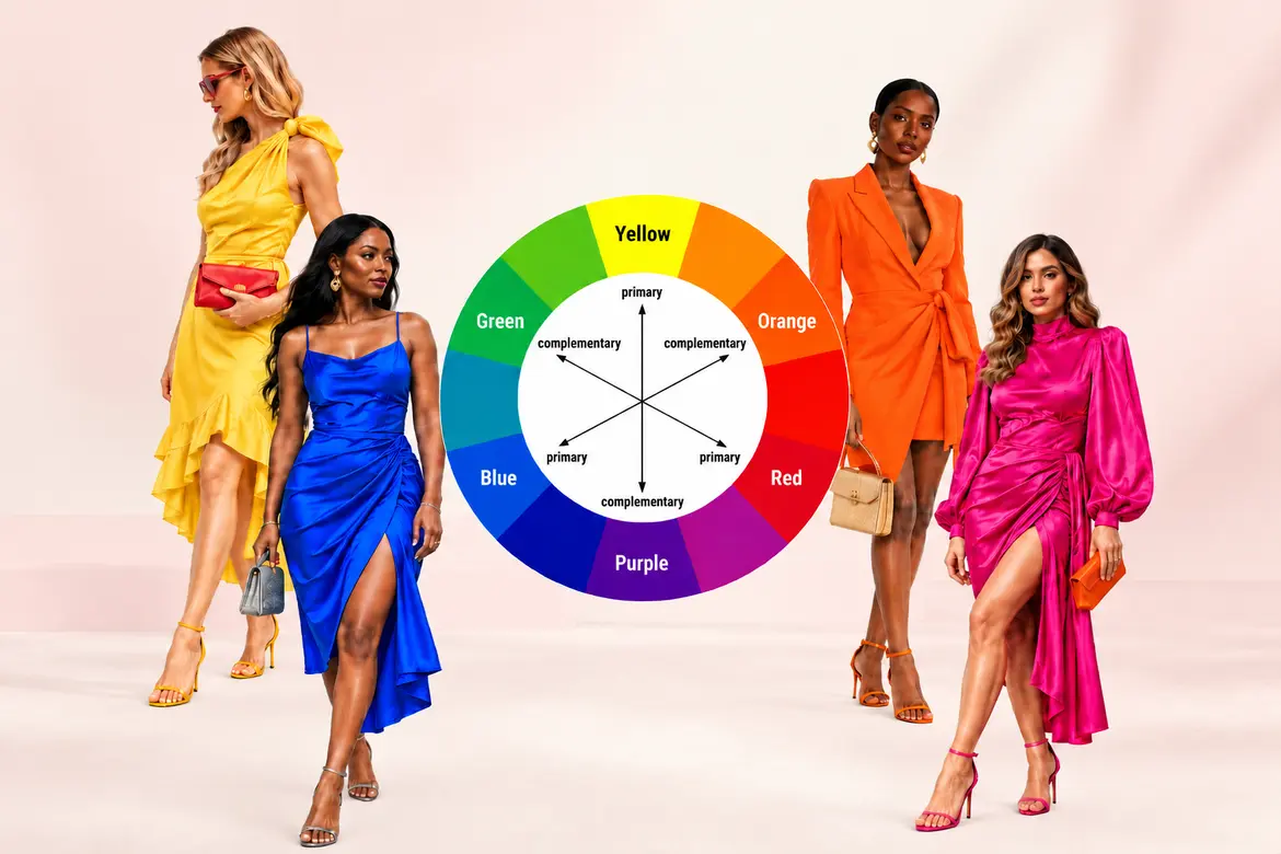
Picture a wheel divided into twelve slices. The three primaries, red, yellow, and blue, sit evenly spaced around it. Mix any two, and you get the secondaries: green, orange, and purple. Mix a primary with its neighbor, and you land on the in-betweens like teal, coral, and burgundy, the shades that tend to feel more grown-up and less crayon-box.
That’s the whole map. Everything else is just knowing which points on it play nicely together. There are four relationships worth committing to memory, and honestly, four is plenty.
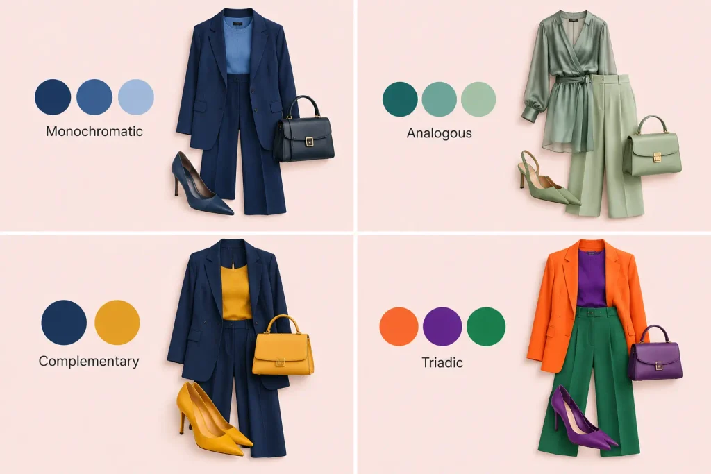
Monochromatic
One color, several depths of it. A deep charcoal suit with a lighter grey shirt. A navy dress with midnight-blue heels. This is the quietest, most sophisticated way to dress, because there’s no risk of a clash; everything is a cousin of everything else. The trick to keeping it from looking flat is texture. Silk against wool, satin against matte, and a knit against something smooth.
Analogous
Colors sitting side by side on the wheel: blue, blue-green, and green. They share a common undertone, so the transition between them feels calm and easy on the eye. Think a teal dress with emerald accessories or a rust-toned tie against a warm brown jacket. Analogous pairings feel harmonious almost automatically, which makes them a safe bet when you’re not sure.
Complementary
Colors directly across from each other: navy and mustard, burgundy and forest green, and orange and blue. This is the high-contrast play, the one that turns heads. It’s also the one that needs a light hand. Straight-up primary red against primary green looks like a holiday decoration. Nudge both toward their sophisticated cousins, oxblood and olive instead, and suddenly it’s editorial.
Triadic
Three colors evenly spaced around the wheel, forming a triangle. It’s the boldest scheme and the hardest to pull off at a cocktail event, so most people use a watered-down version: one color dominates the outfit, and the other two show up only in small accents, like a pocket square and a bracelet.
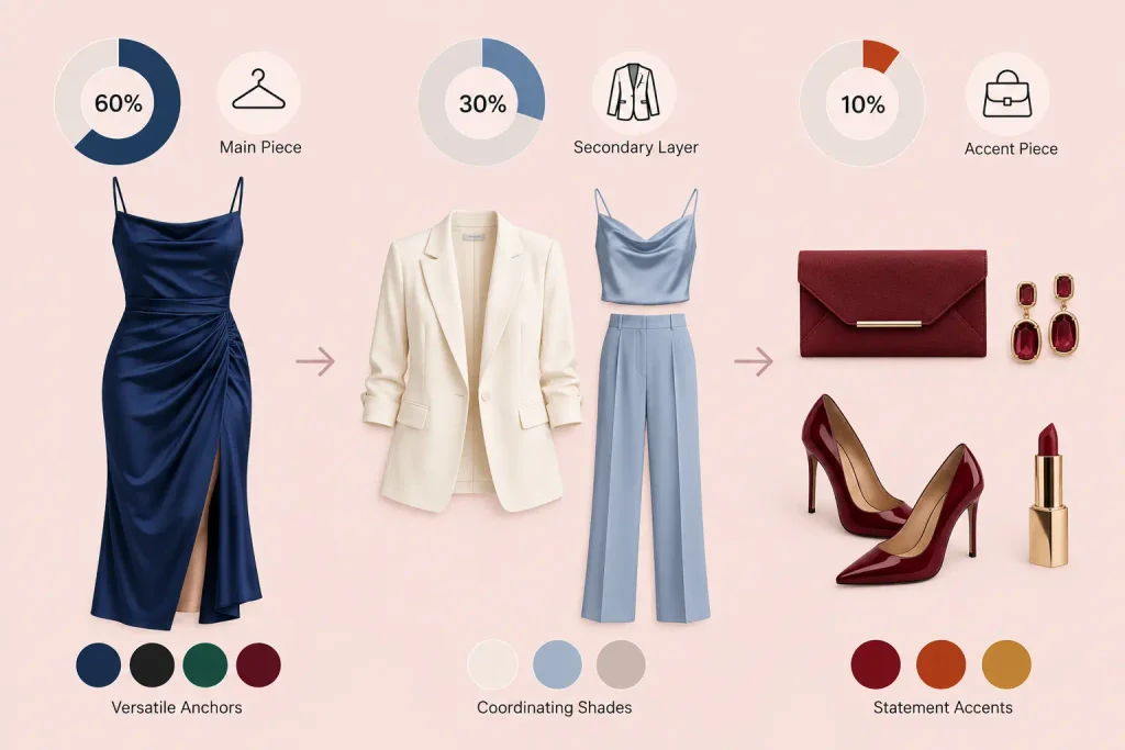
If you take one habit away from this whole guide, make it the 60-30-10 rule, borrowed straight from interior design. Sixty percent of your look is a dominant color, thirty percent is a secondary color, and ten percent is your accent. A navy suit (60), a soft blue shirt (30), and a burnt-orange tie (10). A black dress (60), gold accessories (30), and a deep red lip (10). This single ratio is the difference between “wearing colors” and “wearing a color scheme,” and it’s the fastest way to learn how to match outfit colors that actually look designed rather than accidental.
Before you touch the wheel, read the event
Color theory tells you which shades harmonize. The event tells you which of those you should actually reach for. Skip this step and you can build a technically flawless palette that’s still wrong for the room.
Time of day matters more than people think. A garden party at two in the afternoon and a rooftop gathering at nine at night call for different energy. Daytime leans lighter and warmer, with dusty rose, sage, camel, and powder blue. Evening rewards depth. That’s when the jewel tones and the near-blacks come alive under low, flattering light.
The season shifts the palette too. Spring and summer cocktail attire opens the door to pastels, corals, and soft neutrals. Fall and winter events pull toward burgundy, forest green, plum, and charcoal. You’re not obligated to follow the calendar, but a heavy oxblood velvet in July reads slightly off, the same way a pale linen suit does at a December gala.
And the venue sets the ceiling. A formal ballroom quietly asks for restraint, deeper, more classic colors. A creative industry party or a beach-adjacent celebration gives you room to play. When you’re genuinely unsure how dressy a “cocktail” event will be, err toward a darker, cleaner palette. It’s far easier to look slightly overdressed and elegant than slightly underdressed and casual.
The step everyone skips: your undertone
Here’s the honest truth stylists know and most articles gloss over. The “best” cocktail attire colors don’t exist in a vacuum. The best colors are the ones that flatter you, and that comes down to your skin’s undertone.
Undertone isn’t how light or dark your skin is. It’s the quiet cast underneath. Warm undertones lean golden, peachy, or yellow. Cool undertones lean pink, red, or blue. Neutral sits in between and can swing either way.
A quick wrist-vein test can help: look at the veins on your inner wrist in natural light. Greenish veins usually point to warm undertones. Bluish or purple veins point to cool. Can’t tell? You’re probably neutral, which is genuinely a gift; most colors will work on you.
Why this matters for your palette:
- Warm undertones glow in earthy, sun-drenched shades: olive, rust, camel, warm burgundy, golden yellow, and coral.
- Cool undertones come alive in jewel tones and crisp shades: emerald, sapphire, ruby, true red, plum, cool grey, and clean white.
This is the layer that turns color theory into your color theory. The wheel gives you harmonious combinations; your undertone tells you which starting point on the wheel will make your face look brighter instead of washed out. A cool-toned person in a warm mustard can look tired. Swap that mustard for a cool jewel-toned amethyst, and the same person looks lit from within.
Building your cocktail palette, piece by piece
Now let’s put the pieces together. The approach is the same whether you’re working with a dress or a suit: pick a hero color, then build around it using the wheel.
Start with your anchor (60%)
This is your 60 percent: the largest piece, usually the suit or the dress. Choose it based on the event and your undertone. Navy, charcoal, emerald, burgundy, and black are the reliable anchors for cocktail attire because they photograph well, hide the small sins of a long night, and pair with almost anything.
Add your secondary (30%)
This is your 30 percent: a shirt, a wrap, and a blazer over the dress, the second major element. Use the wheel here. Going analogously? Pick a neighbor of your anchor. Want quiet elegance? Stay monochromatic and choose a lighter or darker version of the same color.
Finish with your accent (10%)
The 10 percent. A tie, a pocket square, heels, a clutch, a bold lip, statement earrings. This is where a complementary color earns its place, because in a small dose, high contrast reads as confidence rather than chaos. A forest-green dress with a small burgundy clutch. A grey suit with a rust tie. Little pops, big payoff.
The reason this method works is that it removes the guesswork. You’re never asking “does this go?” in the abstract. You’re asking “is this the neighbor, the opposite, or a shade of my anchor?” and the wheel answers instantly.
The most reliable cocktail attire colors, decoded
You could technically wear anything the wheel allows. But a handful of colors have earned their reputation at these events for a reason. Here’s how they actually behave.
| Color | Why It Works | Pairs Beautifully With | Best For |
|---|---|---|---|
| Navy | Softer than black, endlessly flattering, photographs richly | Blush, gold, burgundy, soft blue | Almost any cocktail event |
| Emerald | The universally loved jewel tone makes most skin glow | Gold, navy, blush, plum | Evening, fall/winter, festive |
| Burgundy | Warm, rich, quietly luxurious | Navy, forest green, camel, gold | Autumn, formal-leaning events |
| Charcoal Grey | Modern, sleek, less severe than black | Nearly everything | Corporate-adjacent, evening |
| Black | The safety net, sharp and formal | Metallics, jewel tones, a bold lip | When in doubt, or in a very dressy room |
| Blush / Dusty Rose | Soft, romantic, flattering in daylight | Grey, navy, gold, sage | Daytime, spring/summer |
| Sapphire Blue | Bold without being loud | Silver, white, grey | Evening, statement looks |
A note on Black, since it comes up constantly. Yes, you can wear black to a cocktail party. It’s the most forgiving color there is and never reads as a mistake. The only real risk is looking a touch severe or blending into a sea of other black outfits. Break it up with a metallic accent, a jewel-toned accessory, or texture, and it goes from safe to striking.
What colors to be careful with
There’s no official banned list, but a few shades carry risk worth naming.
- White and ivory at weddings: obvious, but it still happens. Avoid anything that could photograph as bridal. At a non-wedding cocktail event, crisp white is fair game and can look wonderfully sharp.
- Neon and highlighter brights: a genuinely tricky call. Under evening lighting they can look garish, and they rarely flatter skin. If you love a bold color, reach for its saturated, deep cousin instead: cobalt over electric blue, magenta over hot pink.
- Head-to-toe beige or all-nude tones: technically safe, often forgettable. Cocktail attire is a chance to look a little glamorous. A fully neutral look can read as underdressed unless you’re leaning on serious texture and tailoring to carry it.
None of these are hard rules. They’re just the shades that ask for a second thought before you commit.
Men versus women: the same wheel, small adjustments
The color wheel doesn’t care about gender, and the underlying logic is identical for everyone. The application shifts slightly.
For men
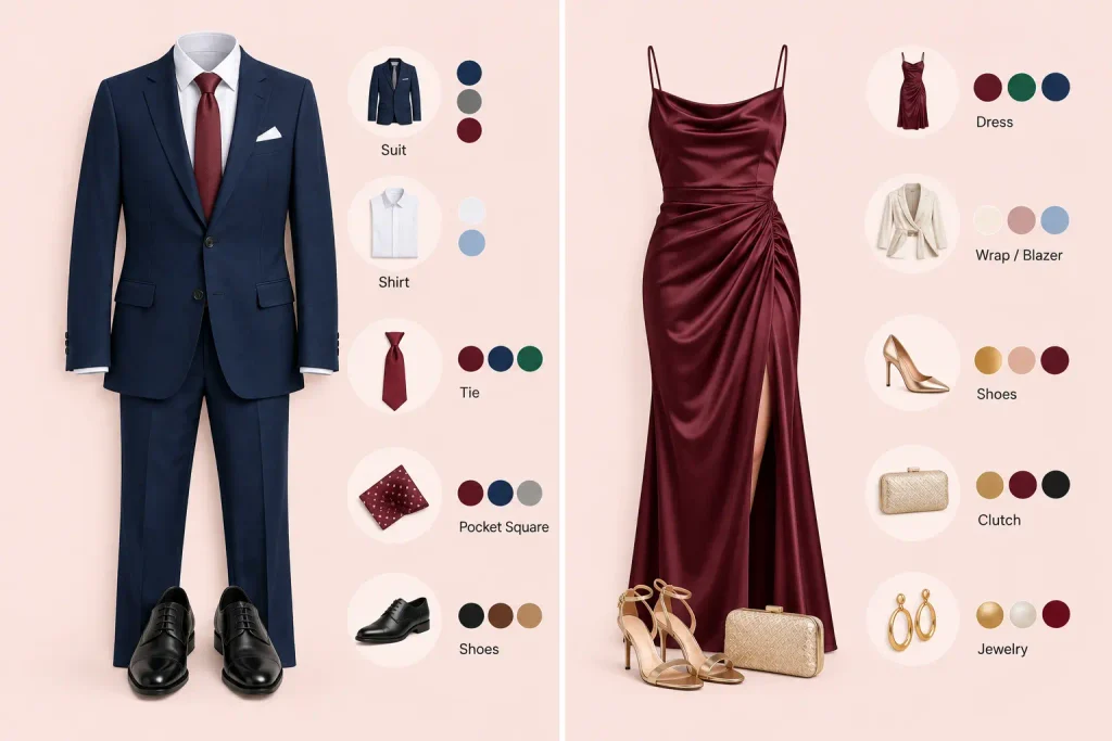
Cocktail attire color choices tend to concentrate on the suit, shirt, tie, and pocket square. The suit is almost always your anchor (navy, charcoal, and increasingly deep green or burgundy for the more adventurous). The shirt is your secondary, usually a shade of white or blue that stays out of the way. The tie and pocket square are where the color theory gets to show off, this is the natural home for a complementary accent. Coordinate the pocket square to echo the tie, not match it exactly.
For women
Cocktail dress colors carry more of the load because the dress is a single large block of color. That makes your anchor choice more consequential, but it also gives accessories enormous power as the accent layer. A monochromatic dress with a metallic or complementary clutch, shoe, and jewelry story can do more work than an entire men’s outfit. The 60-30-10 rule maps cleanly: dress is the 60, a wrap or blazer or shoes the 30, and jewelry and lip the 10.
What real people actually argue about
Spend ten minutes in fashion communities on Reddit or Quora, and the same handful of debates will surface again and again. They’re worth knowing, because they reveal where the “rules” are softer than they seem.
The biggest recurring theme is that people overthink matching and end up too matchy. The community wisdom is nearly unanimous: your accessories should coordinate, not match. A burgundy tie does not require burgundy shoes. In fact, matching everything perfectly is one of the fastest ways to look less expensive, not more.
The second is undertone, which comes up constantly once people discover it. The most upvoted advice across these threads tends to be the wrist-vein test and the reminder that the color that looks incredible on your friend may do nothing for you, because you have different undertones. Once someone learns their undertone, they usually describe it as a lightbulb moment.
The third is a quiet consensus that jewel tones are the great equalizer. Emerald, sapphire, ruby, amethyst, these deep, saturated colors flatter an unusually wide range of skin tones, which is exactly why they keep showing up in every cocktail-color conversation.
Putting it all into one decision
Here’s the whole method, compressed into something you can run in your head while getting dressed.
- Read the event. Time, season, venue. This sets whether you’re in light-and-warm or deep-and-rich territory.
- Know your undertone. Warm leans earthy; cool leans jewel-toned. This picks your starting point on the wheel.
- Choose your anchor. The 60 percent, from the reliable cocktail colors that suit both the event and your undertone.
- Build with the wheel. Monochromatic for quiet elegance, analogous for effortless harmony, and a complementary accent for confidence.
- Honor 60-30-10: dominant, secondary, accent. Never let everything shout at once.
Do that, and you’ve answered the color question the invitation never bothered to. Not with a trend that expires in a season, but with a system that works for the next event and the one after that.
The Takeaway
Cocktail attire has a reputation for being confusing, but almost all of that confusion lives in the color decision, and that’s the part with an actual system behind it. The color wheel isn’t a fashion trend. It’s a set of relationships that have held true for a hundred years and will hold true for the next hundred.
Learn your undertone. Pick an anchor. Build with neighbors, opposites, or shades. Keep the 60-30-10 ratio in your back pocket. Do that, and the next time an invitation says cocktail attire in that slightly fancier font, you won’t feel a flicker of dread. You’ll already know your color.
Frequently Asked Questions
Q. What colors are best for cocktail attire?
Ans. Navy, emerald, burgundy, charcoal, and black are the most reliable cocktail attire colors because they photograph well, suit a wide range of undertones, and pair easily with accents. For daytime or warmer seasons, blush and soft neutrals work beautifully. The genuinely “best” color, though, is the one that flatters your skin’s undertone; warm undertones glow in earthy shades, and cool undertones in jewel tones.
Q. Can you wear black to a cocktail party?
Ans. Yes. Black is the most forgiving and reliably appropriate choice for cocktail attire. The only downside is that it can look a little severe or blend in with other guests. Break it up with a metallic accessory, a jewel-toned accent, or a textured fabric so it reads as intentional rather than default.
Q. How do you match outfit colors using the color wheel?
Ans. Pick one anchor color, then choose supporting colors based on their position on the wheel. Neighbors (analogous) create calm harmony, opposites (complementary) create bold contrast, and shades of your one color (monochromatic) create quiet elegance. Then apply the 60-30-10 rule: 60% dominant color, 30% secondary, 10% accent.
Q. What colors should you not wear to a cocktail event?
Ans. Avoid white or ivory at weddings, since they can read as bridal. Neon brights tend to look harsh under evening lighting and rarely flatter skin, reach for a deeper version instead. Head-to-toe beige can look underdressed unless you lean on strong texture and tailoring. Beyond those, the wheel gives you enormous freedom.
Q. Do cocktail dress colors change by season?
Ans. They do, and following the season is a subtle marker of a considered outfit. Spring and summer open up pastels, corals, and light neutrals. Fall and winter pull toward burgundy, forest green, plum, and charcoal. You’re not locked in, but matching your palette to the season helps the whole look feel current.

1 comment
[…] matte so it doesn’t fight the pants. If you want to get deliberate about it, our guide to matching outfit colors with the color wheel breaks down which shades actually work […]